Tips and Techniques to Develop Responsive Emails (with CSS code samples)
Email marketing remains one of the most effective methods for driving business growth. Yet with all the noise out there, it’s not enough to reach out to customers, you need to stand out so they want to engage with you.
Designing effective and visually appealing emails that work across all email clients and devices, can be difficult. Because different email clients and devices support varying levels of HTML and CSS, knowing how to code responsive emails that look great for everyone, regardless of device, is essential. In this blog, we'll look at some tips and tricks for creating responsive emails that work in a variety of email clients.
Use Media Queries for Layout
Media queries are an effective tool for designing responsive email layouts. You can use media queries to change the layout of your email based on the size of the screen.
Here's an example of how to use media queries to generate a two-column desktop layout and a one-column mobile layout:
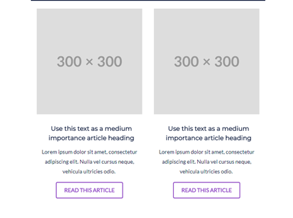
Example of two column design in desktop:
Example of two columns design in mobile:
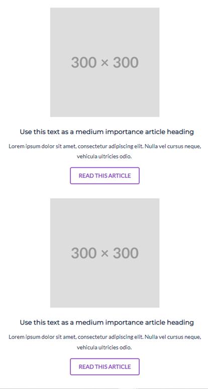
In this example, media queries allow devices to modify and optimize the email layout based on screen size. Mobile devices with a width of 767px or smaller will see a one-column layout. Devices with a width of 768px or more see a two-column layout with flexbox for desktop devices with a width of 768px or more.
If you’re not familiar with flexbox layouts, they allow you to optimize dynamic layouts regardless of the device size. In this scenario, the two columns should render appropriately whether the width is a tablet-sized 768px or a wide computer screen that’s 1800px or wider.
Use Fluid Images
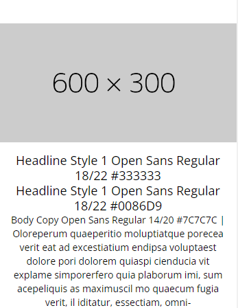
Displaying images can be challenging in responsive email development. One solution is to use fluid images, which automatically resize based on the width of their container. You can do this by using the following code to auto-size the image:

Example with above code:
Without the above code, the images will not appear correctly on mobile devices and will break away from the body of the email as in the example below:
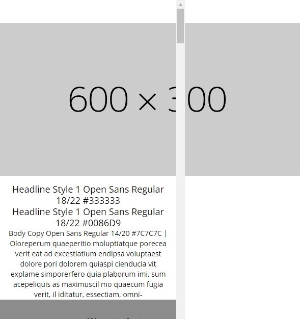
By using the max-width property you can ensure that the image doesn't exceed the width of its container. Moreover, by setting the height property to auto to maintain the aspect ratio of the image.
Use Responsive Typography
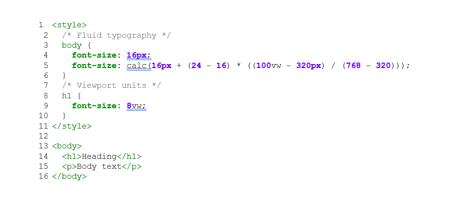
In addition to layout and graphics, typography is a significant element in producing responsive email designs. By using responsive typography techniques such as fluid typography and viewport units, you can ensure that your text scales based on screen size so people can ready your content regardless of the device they use. The below code snippet demonstrates how you can use fluid typography in your emails.
In this example, we use calc to create fluid typography that adjusts based on the width of the viewport. We also use viewport units (vw) to set the font size of the h1 element based on the width of the viewport.
Coding Emails for Outlook
Outlook is a notoriously difficult email client to code for. Here are some tips to ensure that your emails look good in Outlook:
Use Tables for Layout
Because Outlook has limited support for CSS, using table-based layouts is the most reliable way to ensure consistent rendering across all email clients. For maximum compatibility, use nested tables with inline styles. Here is an example of what that looks like:
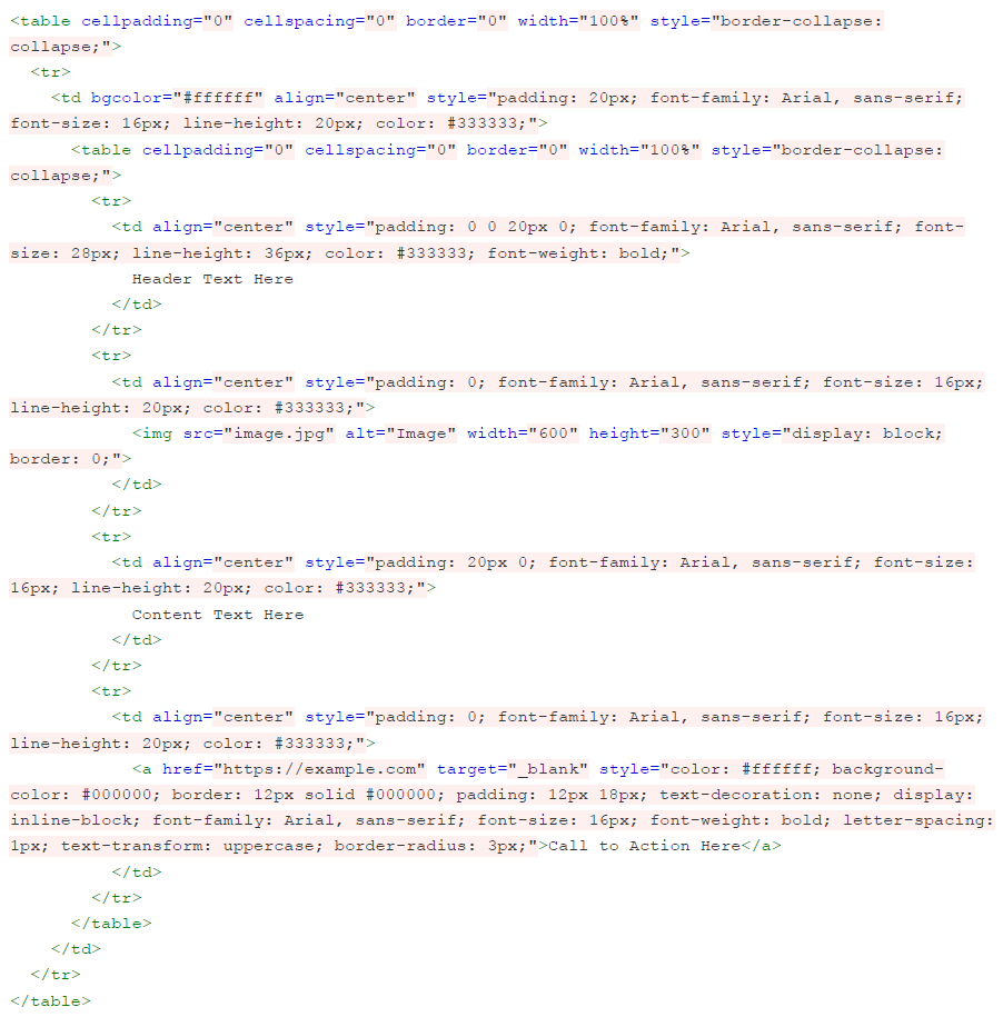
The code above uses nested tables to create a two-column layout. The outer table has a width of 100% to ensure that it adapts to the width of the device, while the inner table has a fixed width of 600px for desktop devices. We also use the max-width property to ensure that the table doesn't exceed 600px on smaller devices.
Use VML for Background Images
Outlook 2007-2013 does not support CSS background images, but it does support a technology called Vector Markup Language (VML), which can be used to create background images. Here is an example of how you can use VML background images in your emails.
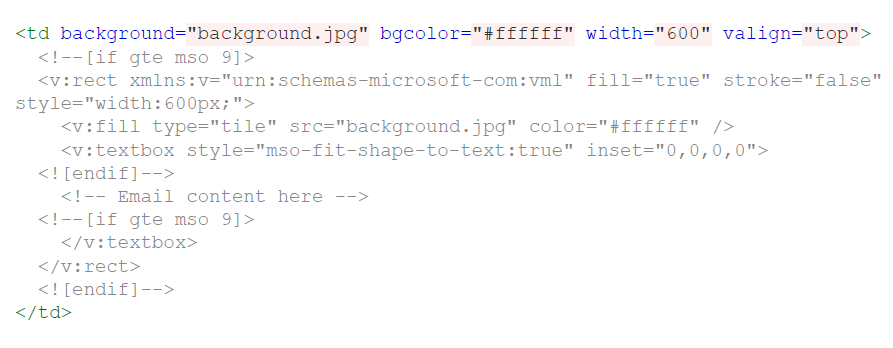
In this example, the background attribute specifies the background image, and calls for Outlook to use VML to fill the table cell with the image. The bgcolor attribute provides a fallback background color for clients that do not support background images.
Use Conditional Comments
Outlook 2007-2013 also has limited support for modern HTML and CSS. To ensure that your email looks good in these clients, you can use conditional comments to target specific versions of Outlook. Here is an example:

In this example, we use a conditional comment [if (gte MSO 0)|(IE)] to target Outlook and Edge, giving these apps directions to use a table with inline styles for layout.
Use Inline Styles
Since Outlook doesn't support external stylesheets, it's important to use inline styles for all CSS. This means that each HTML element should have its own style attribute, as in the below code example:

By using inline styles to set the width of the table, the padding and background color of the table cell and the styles for the heading and body text, you can ensure your emails render appropriately..
By using tables for layout, VML for background images, and conditional comments to target specific versions of Outlook, you can create emails that look good and render consistently across all email clients. Remember to test your emails on multiple devices and clients to ensure that they look good everywhere.
Coding Emails for Gmail
While Gmail supports many modern HTML and CSS features, there are still some best practices to keep in mind when coding emails for this platform:
- Use inline CSS styles instead of embedded or external stylesheets.
- Avoid using position: absolute or position: fixed CSS properties.
- Use HTML tables for layout instead of divs.
- Use mso-* CSS properties for Outlook and data-* attributes for Gmail.
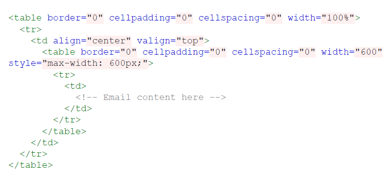
Here's an example of an email layout using tables:
Test Your Emails
Finally, it's important to test your emails thoroughly to ensure that they look good on all devices and email clients. One of the most efficient ways to do so is using testing tools such as Litmus or Email on Acid to ensure your emails render correctly across different devices and email clients.
Successfully Coding Responsive Emails Means Factoring in Requirements of Different Clients
When coding responsive emails, it's important to keep in mind the different rendering engines of email clients and their varying levels of HTML and CSS support. By following the tips and techniques outlined here, you can create effective and visually appealing email campaigns that look great on any device and email client. Remember to test your emails thoroughly on different devices and email clients to ensure they look great for everyone.
Leverage the Power of BDO Digital
If you lack the necessary resources for your email campaigns, our industry-leading certified team can create, manage, deploy and monitor your email marketing campaigns. Explore how your email campaigns can make more of an impact with our managed services team or contact us today to start the conversation.
SHARE